Red, Amber, Green: How a Traffic-Light Dashboard Cuts Through Certificate Chaos
Every business that tracks certificates hits the same wall. You've got a list of expiry dates — in a spreadsheet, a notebook, or just in your head — and you need to answer one question: what needs attention right now?
That question should take 2 seconds to answer. If you're scanning rows of dates and doing mental arithmetic, it's taking you 2 minutes. Multiply that by every time you check, and you're losing hours to a problem that a traffic light solves instantly.
How traffic-light status works
The principle is dead simple:
- Red — expired. The certificate has lapsed. This needs immediate action.
- Amber — expiring within 30 days. Time is running out. Book the renewal now.
- Green — valid. More than 30 days until expiry. No action needed.
That's it. No complex scoring systems, no risk matrices, no dashboards that need a training session to understand. If you can read a traffic light, you can read the dashboard.
The status is always calculated from the actual expiry date — it's never stored as a static value that could go stale. Every time you open the dashboard, the status is recomputed in real time.
The Certificates view: your complete picture
The main dashboard shows every certificate you're tracking, sorted by urgency. Expired certificates surface to the top. Expiring ones sit below them. Valid certificates — the ones you don't need to worry about — fade into the background.
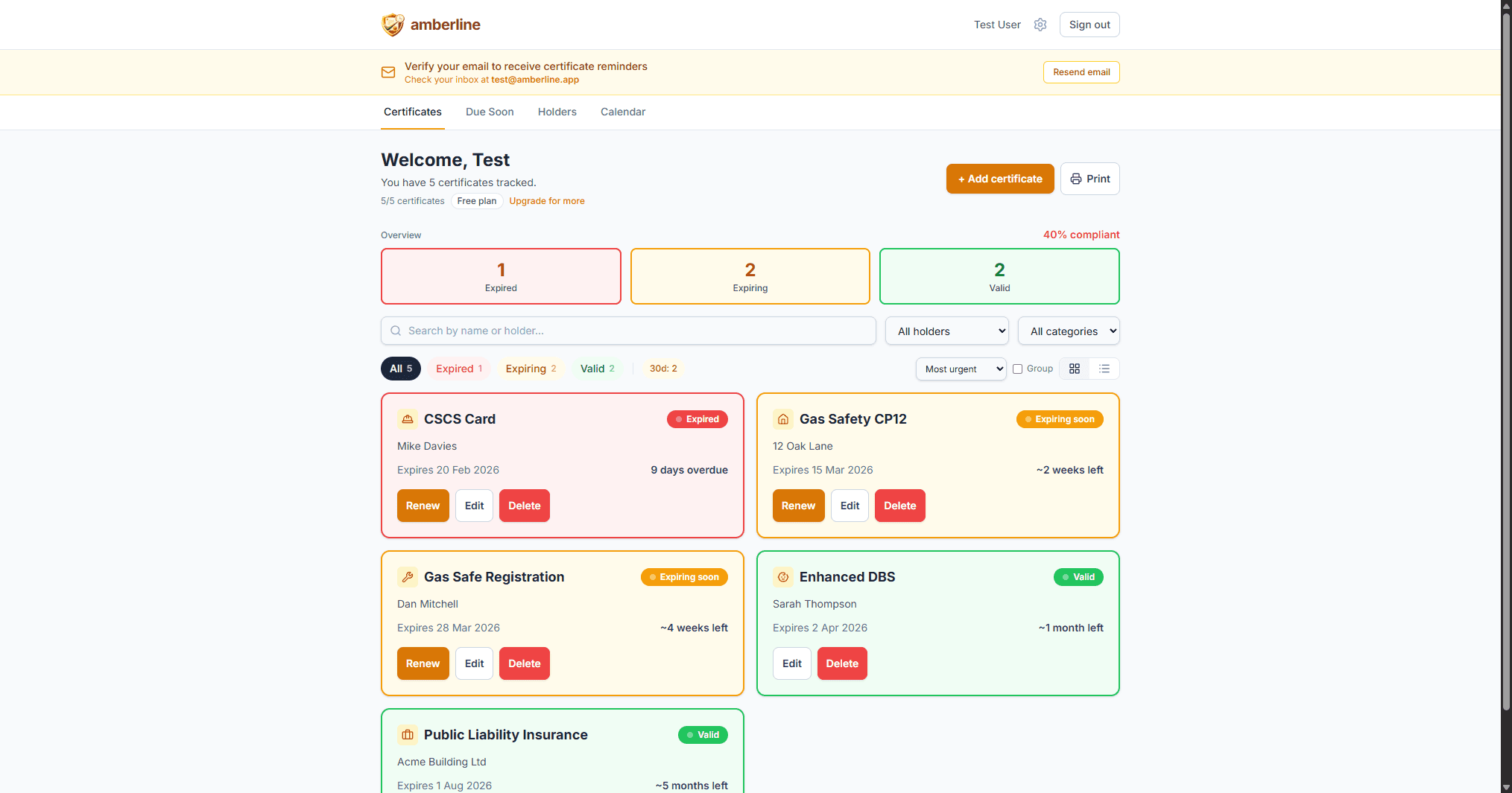
The overview boxes at the top give you the numbers: how many expired, how many expiring, how many valid. On mobile, these boxes double as filters — tap "Expired" to see only the red ones.
This is the view that replaces your spreadsheet. Instead of scanning 50 rows of dates, you glance at three numbers and immediately know whether you have a problem.
The Due Soon view: what needs action now
Knowing that you have 4 expiring certificates is useful. Knowing which ones are most urgent is what actually drives action.
The Due Soon view groups certificates by urgency:
- Overdue — already expired. Should have been renewed. Top priority.
- This week — expiring in the next 7 days. Last chance to act.
- This month — expiring in the next 30 days. Book the renewal now.
- Coming up — expiring in 31–90 days. On your radar, no panic yet.

Empty groups are hidden automatically. If nothing is overdue, you don't see an empty "Overdue" section — just a clean list of what's actually coming up. And if everything is valid with nothing due for 90 days, you'll see an all-clear message.
This view is intentionally opinionated. There are no filters or search — it shows you what matters and nothing else.
The Calendar view: plan ahead
Some renewals take time to arrange. A CSCS card renewal requires booking a course. A gas safety certificate requires scheduling an engineer. You can't do these overnight.
The Calendar view shows expiry dates plotted on a month grid, so you can see what's coming up and plan ahead.

This is particularly useful for businesses managing seasonal patterns — construction firms ramping up for summer, landlords managing tenant changeovers, or nurseries preparing for the new school year.
Why traffic-light beats traffic-light-ish
You might be thinking: "I could add conditional formatting to my spreadsheet — green for valid, red for expired." You can. But you'll still have these problems:
No reminders. Conditional formatting shows you the status when you look at it. But spreadsheets don't come to you — you have to remember to check. Amberline sends email reminders at 90, 30, 7, and 0 days before expiry. The dashboard is a bonus, not the primary safety net.
No grouping by urgency. A spreadsheet with conditional formatting still shows every row equally. You have to visually scan for red and amber cells scattered across the sheet. A traffic-light dashboard sorts by urgency — the most critical items are always at the top.
No mobile access. Opening a spreadsheet on a phone at 7am on a construction site is painful. A dashboard designed for mobile puts the information where you actually need it.
Who uses traffic-light dashboards?
The traffic-light model works across every industry that tracks certificates:
- Construction firms tracking CSCS cards, IPAF licences, PASMA certificates across a team of operatives
- Landlords managing gas safety, electrical, and energy certificates across multiple properties
- Nurseries tracking DBS checks, first aid, and safeguarding qualifications for every staff member
- Trade businesses monitoring Gas Safe registration, Part P, and professional accreditations
The certificates are different. The renewal cycles are different. But the question is always the same: what's expired, what's expiring, and what's fine? Red, amber, green answers that instantly.
Simplicity is the feature
There's a reason we don't offer 5-tier risk ratings, custom colour schemes, or configurable thresholds. The traffic-light model works because it's universal, instant, and requires zero training.
A builder on a phone at 7am doesn't want to learn a dashboard. They want to see green and get on with their day — or see red and know exactly what to do about it.
That's what a traffic-light dashboard gives you. Nothing more, nothing less.
Ready to stop tracking certificates in spreadsheets?
Start free with up to 3 certificates. No card required.
Get started free